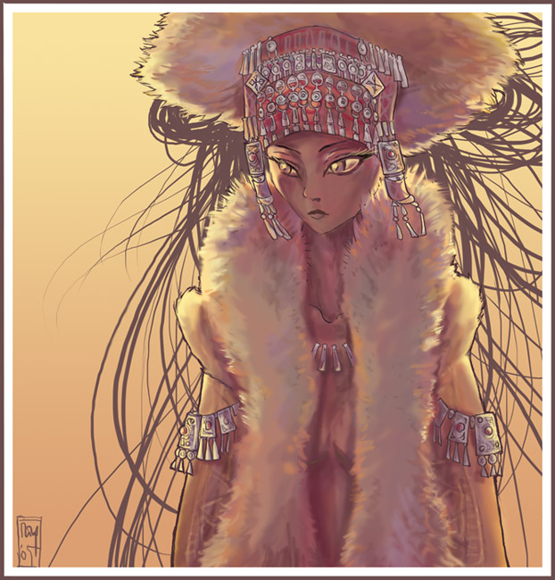
EDIT: changed the face. Major improvement in my opinion!
See for yourself the first version: [link]
Fur is great to draw, you should try it!
Little experimental: a combination of 'hard' outlines and soft no-outlines at all. I also like the contrast between the texture of the clothing and the 'flat' hair.
I saw 'Alexander' in italian this summer 0__o
Can't really judge the film (didn't understand a word) but THE COSTUMES!!! Oh lala, I'm completely in love!
This pic is inspired by the clothes of Rosaria Dawson in that film.
Wow, awesome colouring! I love the warm tones and how you coloured the silver stuff The fur looks nice as well.
As to the outline combination, I noticed this before reading your comment, and personally I think I like the parts with outlines better than the fur without it. This is a matter of personal taste however
The "flat" hair looks gorgeous in my opinion! I wouldn't have really noticed a strong contrast but I think it just fits the pic
I love how you did the lighting and shading on her face and her eyes but nevertheless her face looks somewhat crooked to me. I'm tried to figure out what it was and I think it's the mouth that looks a little off to me, it looks less lively to me than the rest of the face.
Oh, and I just admire the detail you put into the jewellery, I can never think of anything to draw for stuff like that So, great art! Keep it up
-- "Gravitation is not responsible for people falling in love." - Albert Einstein
Thanks!!
About the outline: i normally always draw one, but in this case the parts without still have the dark background of the hair behind it, and 'stand out'. I'm happy to hear your opinion about it!
The face: well i often have problems with wrong proportions that i don't notice anymore, i'll have a second look at the mouth because i agree that there is something boring/simplistic about it.
Thanks again!
Ooooh wow, I simply love the colors of this, and that FUR.... Sooo nice!! Ahh I want to touch the fuuurrr.... I love the warm lighting too! Such detailed jewely, I can never design things like that!
Wow. That fur is just AMAZING. Beautiful texture and shading on it. I love the colors you chose as well--very soft and warm. I like the hair, you do such fun hair. Thought I'm not sure how well it goes with the softer lines. But as you said this was experimental and it's only being knit-picky of me to say anything. :3 It looks great!
--
"You are not to swing from my elbow. You are to show fear and respect to my elbow!" --Vendetta, Making Fiends
We want to know what love means to you!
Get your creative juices flowing and design a movie poster for "Paper Heart" that focuses on the theme "What Does Love Mean to Me?".
Below we have compiled a list of 101 tips to help you improve your photography. You may know some of them already but were confident that you'll find at least a few gems in there! Go get yourself a cup of coffee and make sure you are sitting comfortably!
This is a collection of deviations showing real Pinups in the classic Retro poses from various Artists. For the 4rd time I present a variation of Vintage Pinup Queens as well as fresh modern Pinup art. If you love Polkadots, seamed Nylons, Plateau-Heels and and Miles-long-legs you should not miss this collection.
Inspired by Trudi Canavan's "The Black Magician Trilogy" =liam-stock and =Staub-und-Schatten produced stock images with the theme "Black Magic" for you to bring fantasy and magic to life.
When it comes to community spirit, `Rushy is a shining example. From participating in devmeets, to providing positive encouragement to other artists, `Rushy can always be found demonstrating what it really takes to be a true deviant. It's without any hesitation that we are delighted to award the Deviousness Award for July 2009 to `RushyRead More
Devious Comments
Comments
As to the outline combination, I noticed this before reading your comment, and personally I think I like the parts with outlines better than the fur without it. This is a matter of personal taste however
The "flat" hair looks gorgeous in my opinion! I wouldn't have really noticed a strong contrast but I think it just fits the pic
I love how you did the lighting and shading on her face and her eyes but nevertheless her face looks somewhat crooked to me. I'm tried to figure out what it was and I think it's the mouth that looks a little off to me, it looks less lively to me than the rest of the face.
Oh, and I just admire the detail you put into the jewellery, I can never think of anything to draw for stuff like that
--
--
"If it makes you feel good, do it"
About the outline: i normally always draw one, but in this case the parts without still have the dark background of the hair behind it, and 'stand out'. I'm happy to hear your opinion about it!
The face: well i often have problems with wrong proportions that i don't notice anymore, i'll have a second look at the mouth because i agree that there is something boring/simplistic about it.
Thanks again!
--
"Bacteria: The only culture some people have."
--
lets stalk each other x)
It's a fav!
--
Lancaster
--
My 60,000 page views will soon be arriving. Check my DevArt page to see if you're the one to receive personalized gift art from me.
-------------------
"Dying isn't much of a living, boy." Clint Eastwood in "The Outlaw Josey Wales".
--
"You are not to swing from my elbow. You are to show fear and respect to my elbow!" --Vendetta, Making Fiends
--
I
Anyways, awesome picture, the hard lines and the no lines worked out great
--
Chump.
Previous Page12345...Next Page